A shift in security, yet all the same. Every curve meticulously crafted, promising a seamless fusion of technology and elegance.
A Shift In Security
In parallell to Fingerprints' and Infineon's development of their first ever biometric solution for a payment card, there emerged a need for a user experience research report to confirm their design hypotheses. Through a rigorous UX-study, my colleagues provided pivotal insights into the physical layout of the card. Based off of those insights I shaped a concept that embodied their findings while making a striking and recognisable design that provided a seamless experience for users.
Year 2022
Client Fingerprints, Infineon
Role Concept Design, Art Direction, Production
Skillsets 3D, Motion Design, UI
Output
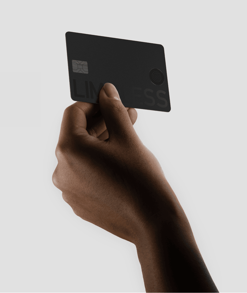
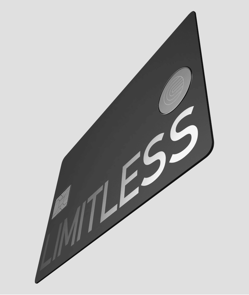
Light to the touch, heavy on security.
A single sensor encapsulated by a aluminium bezel reenforcing the idea of security, accompanied by Fingerprints' iconic tagline "Limitless".
Research findings revealed a preference for black and silver coloured cards. Drawing from this insight the aim was to create something that felt simple and obvious, yet elegant and futuristic.
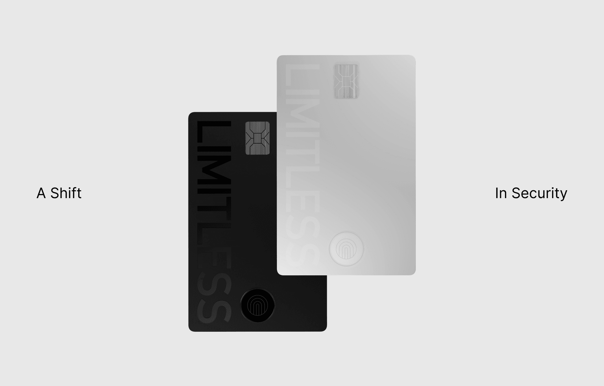
The phrase "A shift in security" emerged early on, serving as a inspiration for much of the visual exploration and layout decisions during the project's initial phases.
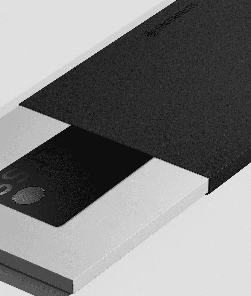
The idea driving the concept of the packaging was one of simplicity — ensuring it didn't overshadow the card's essence.
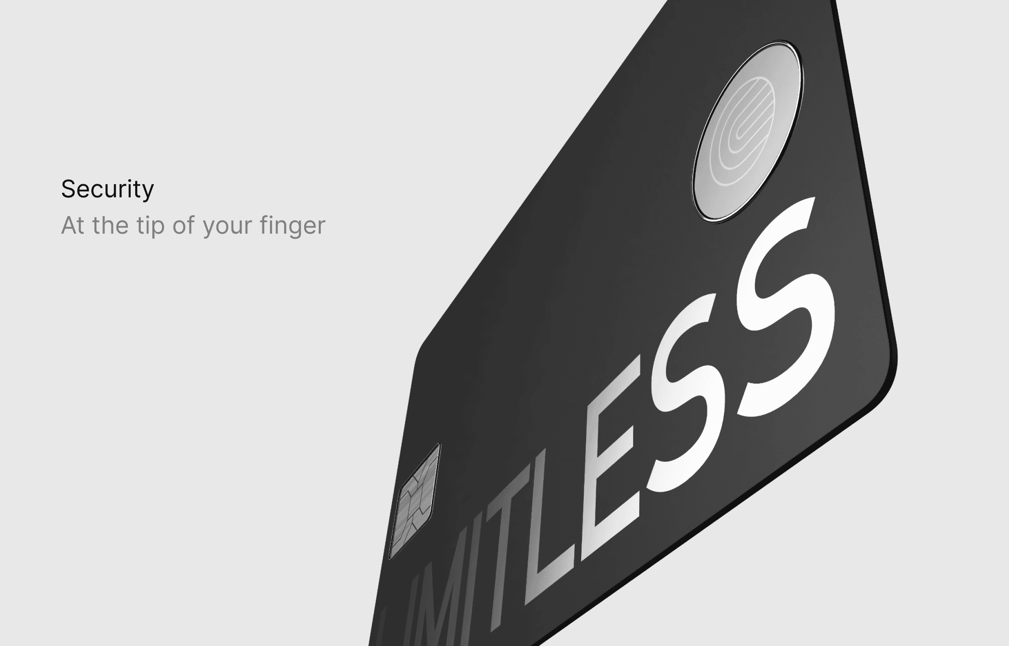
Simple and powerful copy accompanied by larger than life visuals of the cards aims to provide a striking and captivating impression.
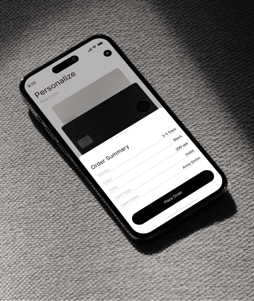
Example of what an ordering process through an enrolment app can look like.
Success screen of placing an order for your card. A journey of seamless delight, spanning from the initial order, through the unboxing, to the card's enrollment. A blend of simplicity and joy from inception to completion.
Results & Takeaways
In the process I gained invaluable insights into the intricate balance between innovation, design and user experience. This journey emphasized the importance of collaboration across disciplines and reinforced the need for iterative refinement to achieve a balanced blend of astetics and usability. Ultimately, I emerged with a deeper appreciation for the transformative power of user-centric design.
Let’s get to know each other.
Reach out.
A shift in security, yet all the same. Every curve meticulously crafted, promising a seamless fusion of technology and elegance.
A Shift in Security
In parallell to Fingerprints' and Infineon's development of their first ever biometric solution for a payment card, there emerged a need for a user experience research report to confirm their design hypotheses. Through a rigorous UX-study, my colleagues provided pivotal insights into the physical layout of the card. Based off of those insights I shaped a concept that embodied their findings while making a striking and recognisable design that provided a seamless experience for users.
Year
2022
Client
Fingerprints, Infineon
Role
Concept Design, Art Direction
Type
3D, Motion, UI
For Fingerprints & Infineon
For Fingerprints & Infineon
Lorem ipsum dolor sit amet, consectetur adipiscing elit, sed do eiusmod tempor incididunt


The phrase "A shift in security" emerged early on, serving as a inspiration for much of the visual exploration and layout decisions during the project's initial phases.


Lorem ipsum dolor sit amet, consectetur adipiscing elit, sed do eiusmod tempor incididunt
The idea driving the concept of the packaging was one of simplicity — ensuring it didn't overshadow the card's essence.


Simple and powerful copy accompanied by larger than life visuals of the cards aims to provide a striking and captivating impression.


Light to the touch, heavy on security.


A single sensor encapsulated by a aluminium bezel reenforcing the idea of security, accompanied by Fingerprints' iconic tagline "Limitless".
Results & Takeaways
In the process I gained invaluable insights into the intricate balance between innovation, design and user experience. This journey emphasized the importance of collaboration across disciplines and reinforced the need for iterative refinement to achieve a balanced blend of astetics and usability. Ultimately, I emerged with a deeper appreciation for the transformative power of user-centric design.
Output
Lorem ipsum dolor sit amet, consectetur adipiscing elit, sed do eiusmod tempor incididunt
Lorem ipsum dolor sit amet, consectetur adipiscing elit, sed do eiusmod tempor.
Lorem ipsum dolor sit amet, consectetur adipiscing elit, sed do eiusmod tempor incididunt ut labore et dolore magna aliqua. Ut enim ad minim veniam, quis nostrud exercitation ullamco laboris nisi ut aliquip ex ea commodo consequat. Duis aute irure dolor in reprehenderit in voluptate velit esse cillum.
Research findings revealed a preference for black and silver coloured cards. Drawing from this insight the aim was to create something that felt simple and obvious, yet elegant and futuristic.


Example of what an ordering process through an enrolment app can look like.
Success screen of placing an order for your card. A journey of seamless delight, spanning from the initial order, through the unboxing, to the card's enrollment. A blend of simplicity and joy from inception to completion.
More
Previous Project
Next Project