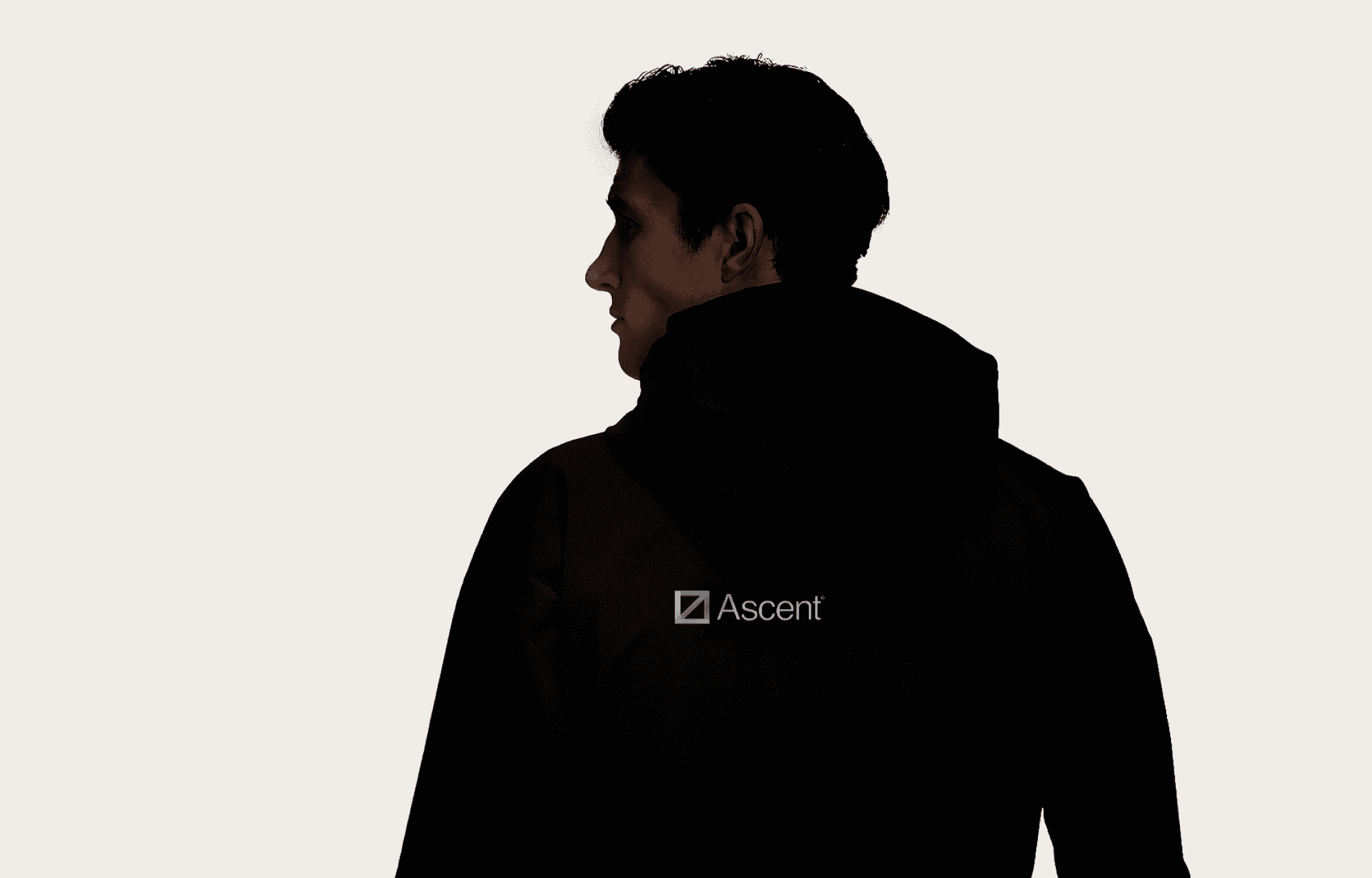
Sharp. Clear. Always Ready. Ascent cuts through chaos, giving rescue teams the edge they need when every second counts.
When Every Second Counts
In the autumn of 2023, I had the privilege of collaborating with T-Kartor, the company most famous for their iconic tourist and subway maps of New York and London.
In addition to their international offerings, T-Kartor has developed a digital map-platform tailored specifically for Swedish firefighters and rescue personnel. The platform leverages T-Kartor’s vast mapping data to provide rescue personnel with a comprehensive overview of the rescue area in order to make collaboration between instances effortless. It was named COP, an abbreviation for Common Operational Picture. Given that the primary audience are firefighters, the name proved to be rather ill-suited.
The project's objective was to propose several alternative names, accompanied by a visual concept for one of the new names. My role involved facilitating creative and strategic workshops, conducting a competitive brand analysis of their Nordic competitors, and developing the concept presented below.
Year 2023
Client Ascent [ T-Kartor]
Role Production, Brand Strategy, Art Direction
Skillsets Graphic Design, UI
Output

The aim of the project was to deliver a compelling and visionary concept that redefined the potential aesthetic of the product. Emphasis was placed on inspiration over practicality.
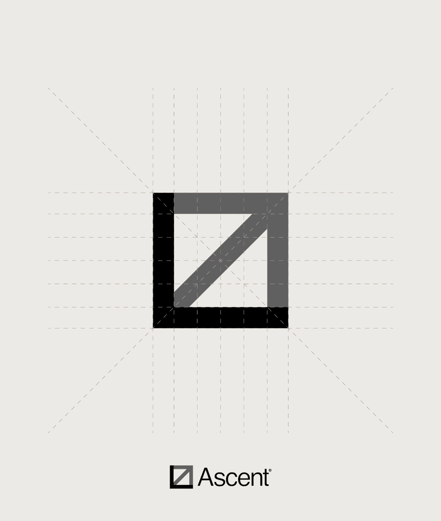
The logo, with its rectangular shape, aims a provide a sense of sturdiness and rigidity.
The name Ascent, “the act of rising or mounting upward”, is captured by the upward trajectory of the arrow in the logo mark. It symbolizes the pursuit of higher ground to gain clarity — the very essence of the Ascent platform.
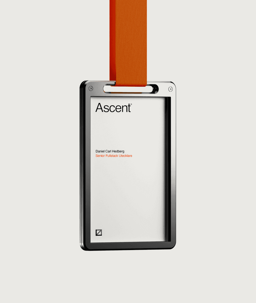
Name tag.
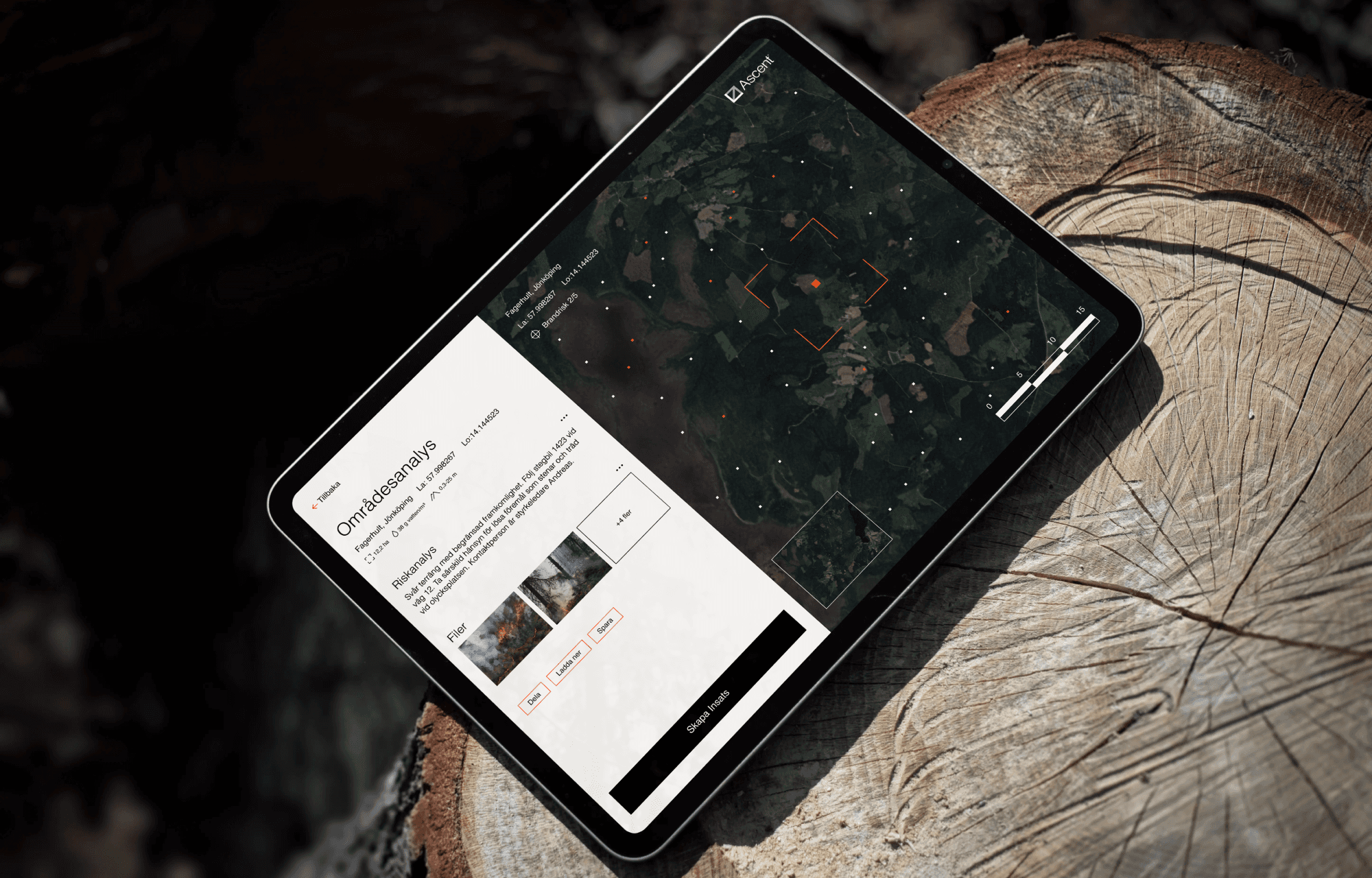
The logo, characterized by its rectangular shape, seeks to evoke a sense of sturdiness and rigidity. The same visual language was also integrated into the interface design — empowering users to make quick and well-informed decisions.

Interface overview.

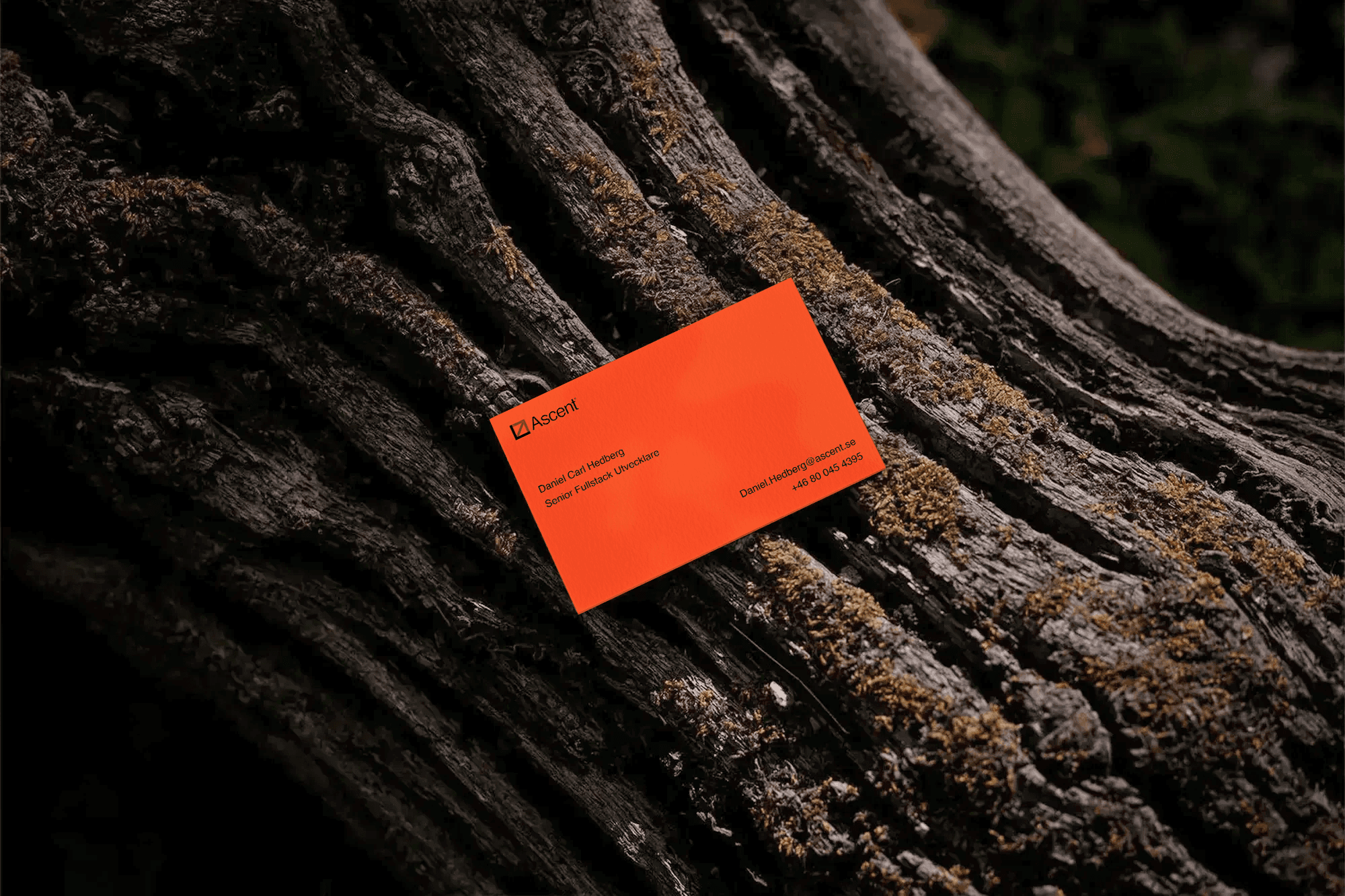
Business card.
Results & Takeaways
The collaboration with T-Kartor offered numerous valuable insights. Despite the project's relatively short duration the decision to facilitate proper workshops and conduct a competitive brand analysis provided immense insights that added real depth to the concept.
The creative process of identifying a new name was both an engaging and a challenging one. The effort was significantly enhanced by the strategic groundwork laid beforehand, which provided a robust foundation that meant that the name(s) both stood out from competitors and managed to encapsulate the essence of the platform.
Let’s get to know each other.
Reach out.
Sharp. Clear. Always Ready. Ascent cuts through chaos, giving rescue teams the edge they need when every second counts.
When Every Second Counts
In the autumn of 2023, I had the privilege of collaborating with T-Kartor, the company most famous for their iconic tourist and subway maps of New York and London.
In addition to their international offerings, T-Kartor has developed a digital map-platform tailored specifically for Swedish firefighters and rescue personnel. The platform leverages T-Kartor’s vast mapping data to provide rescue personnel with a comprehensive overview of the rescue area in order to make collaboration between instances effortless. It was named COP, an abbreviation for Common Operational Picture. Given that the primary audience are firefighters, the name proved to be rather ill-suited.
The project's objective was to propose several alternative names, accompanied by a visual concept for one of the new names. My role involved facilitating creative and strategic workshops, conducting a competitive brand analysis of their Nordic competitors, and developing the concept presented below.
Year
2023
Client
Ascent [ T-Kartor]
Role
Production, Brand Strategy, Art Direction
Type
Graphic Design, UI
For Ascent [T-Kartor]
For Ascent [T-Kartor]
Lorem ipsum dolor sit amet, consectetur adipiscing elit, sed do eiusmod tempor incididunt


The phrase "A shift in security" emerged early on, serving as a inspiration for much of the visual exploration and layout decisions during the project's initial phases.


Name tag.
The name Ascent, “the act of rising or mounting upward”, is captured by the upward trajectory of the arrow in the logo mark. It symbolizes the pursuit of higher ground to gain clarity — the very essence of the Ascent platform.
The idea driving the concept of the packaging was one of simplicity — ensuring it didn't overshadow the card's essence.


Simple and powerful copy accompanied by larger than life visuals of the cards aims to provide a striking and captivating impression.


The logo, with its rectangular shape, aims a provide a sense of sturdiness and rigidity.
A single sensor encapsulated by a aluminium bezel reenforcing the idea of security, accompanied by Fingerprints' iconic tagline "Limitless".
Results & Takeaways
The collaboration with T-Kartor offered numerous valuable insights. Despite the project's relatively short duration the decision to facilitate proper workshops and conduct a competitive brand analysis provided immense insights that added real depth to the concept.
The creative process of identifying a new name was both an engaging and a challenging one. The effort was significantly enhanced by the strategic groundwork laid beforehand, which provided a robust foundation that meant that the name(s) both stood out from competitors and managed to encapsulate the essence of the platform.
Output


Interface overview.


Interface overview.


Business card.


Business card.
Lorem ipsum dolor sit amet, consectetur adipiscing elit, sed do eiusmod tempor.
Lorem ipsum dolor sit amet, consectetur adipiscing elit, sed do eiusmod tempor incididunt ut labore et dolore magna aliqua. Ut enim ad minim veniam, quis nostrud exercitation ullamco laboris nisi ut aliquip ex ea commodo consequat. Duis aute irure dolor in reprehenderit in voluptate velit esse cillum.
The aim of the project was to deliver a compelling and visionary concept that redefined the potential aesthetic of the product. Emphasis was placed on inspiration over practicality.
More
Previous Project
Next Project