A carefully crafted identity spearheading the research community with collaborative tools taking the lead.
Love Your Thinking
Parsd is a Stockholm-based startup that aims to revolutionize the research community. Their digital platform facilitates the sharing of data models and methods, enabling users to spend less time on data summarization and more time on extracting valuable insights from sed data.
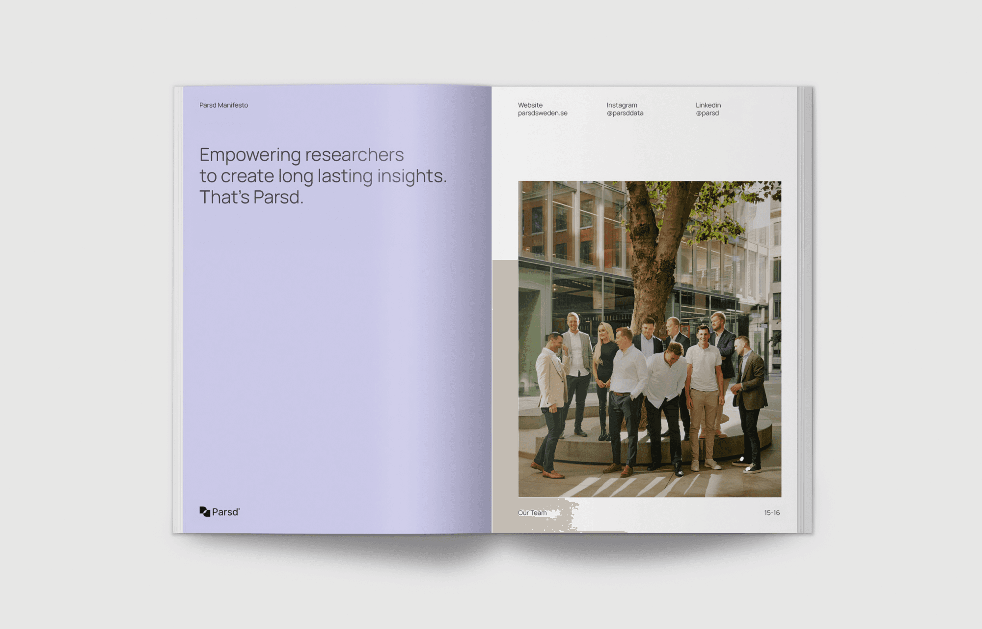
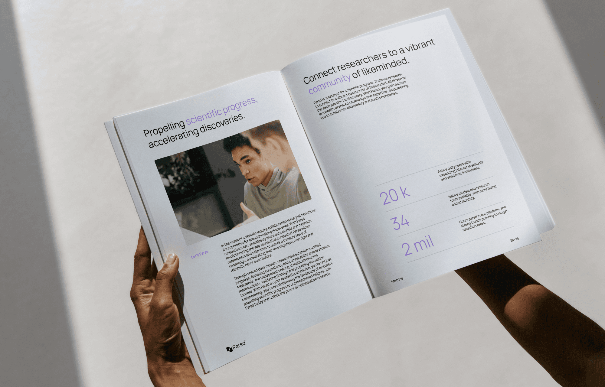
In close collaboration with the founders me and a small design team developed comprehensive brand and communication guidelines for Parsd. The brand system is meticulously designed to reinforce the principles of community and collaboration, which are fundamental to Parsd's ethos.
Year 2021
Client Parsd
Role Design Lead, Production
Skillsets Graphic Design, Motion Design, Branding
Skillsets Graphic Design, Strategy, Motion Design
Output
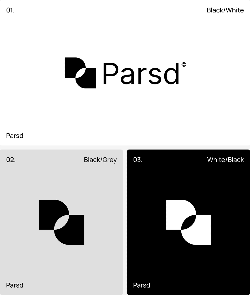

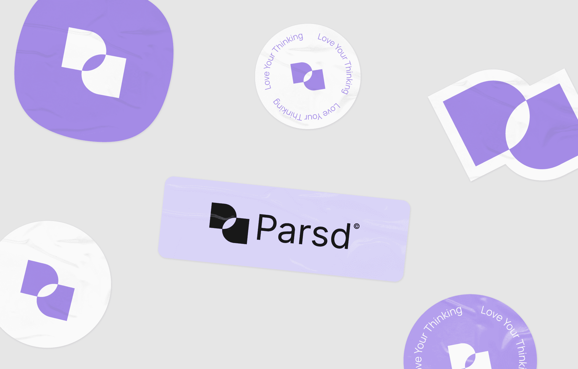
The logomark serves as a cornerstone of the brand, encapsulating the essence of the business.
The logomark visualizes the journey users undertake as they parse data using the Parsd platform. The two rounded rectangles represent the "p" and the "d" of the company name – the start and finish, and the overlap in the center signifies the insights gained through this process.
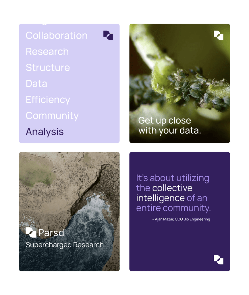
To provide the Parsd team with a strong foundation for their launch, a series of social posts was designed aimed to amplify the brand’s identity.
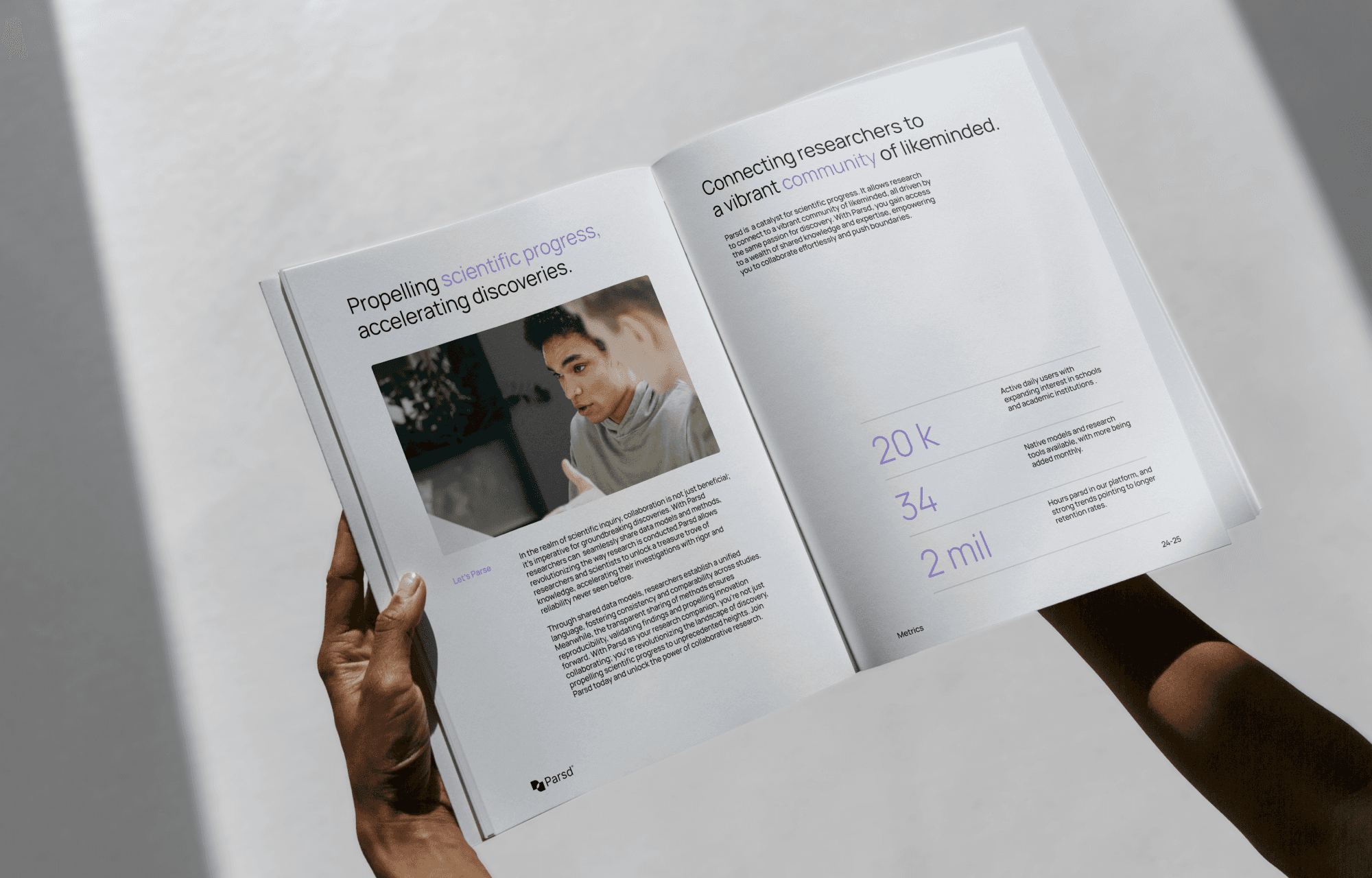
Manrope is the ultimate Swiss Army knife of typefaces. It offers variable weight, extensive language support, and is particularly well-suited for numerical representation — crucial for many researches.
Manropes offers carefully crafted details such as semi-closed apertures, elevated smooth corners, increased mean line and lowered middle line.
The variable weight of Manrope offers enhanced versatility, enabling consistent visual hierarchy across a wide range of use cases.
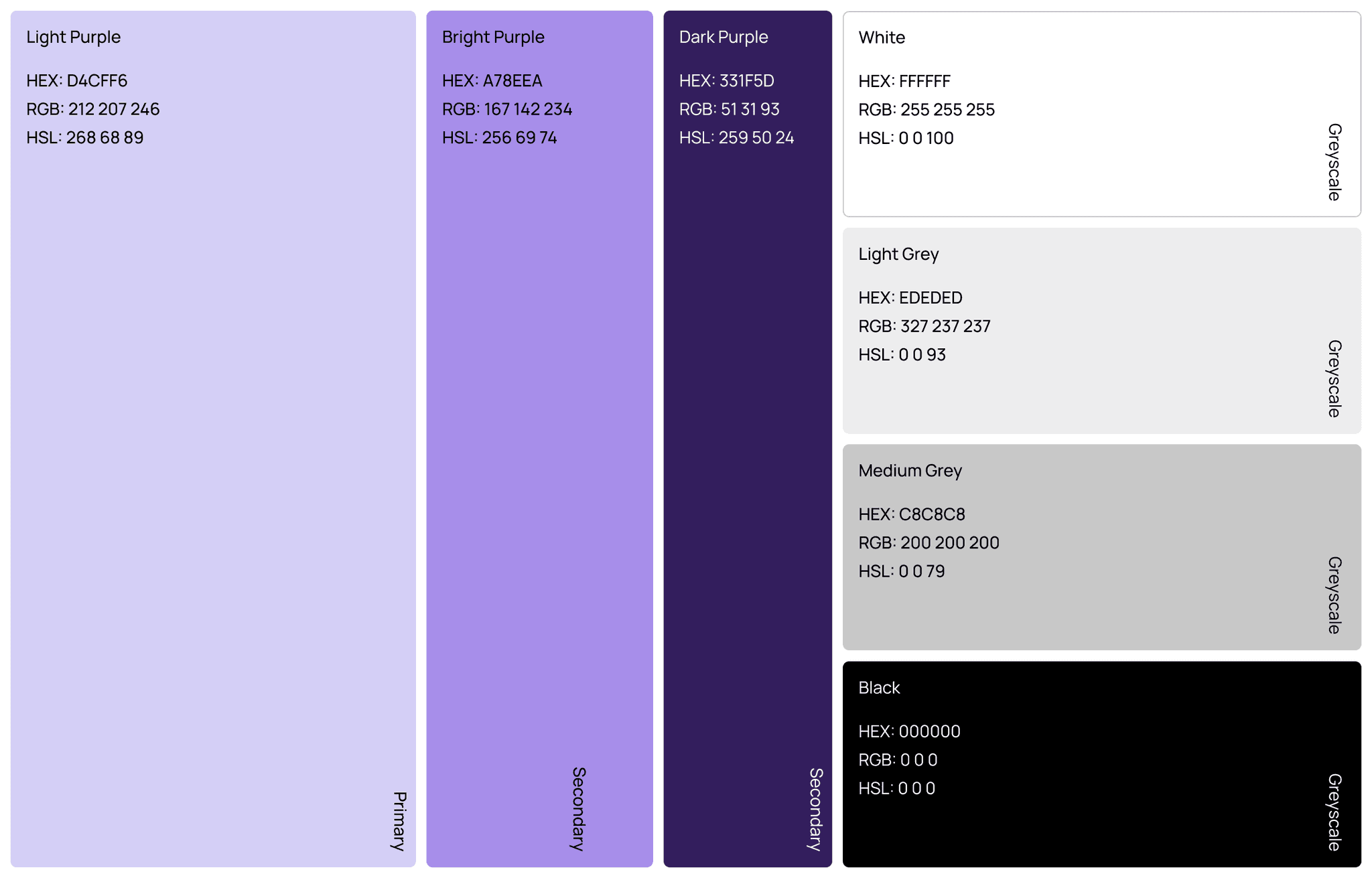
The color palette consists of three distinct shades of purple, infusing the brand with a creative and vibrant essence.
Showcasing the diverse and vibrant research community empowered by Parsd is a central tenet of the brand's identity.

Results & Takeaways
The collaborative effort between our team and the Parsd founders led to the creation of a brand that authentically represents Parsd's commitment to fostering a diverse and dynamic research community. Through meticulous design exploration, we achieved a cohesive visual identity that resonates with Parsd's core values of innovation and collaboration. On a personal level I gained a deeper appreciation for the importance of strategic research such as audience identification and positioning and its crucial role when building a strong and authentic brand.
Parsd went on to do a successful first round of investment securing in the fall of 2021.
Let’s get to know each other.
Reach out.
A carefully crafted identity spearheading the research community with collaborative tools taking the lead.
Love Your Thinking
Parsd is a Stockholm-based startup that aims to revolutionize the research community. Their digital platform facilitates the sharing of data models and methods, enabling users to spend less time on data summarization and more time on extracting valuable insights from sed data.
In close collaboration with the founders me and a small design team developed comprehensive brand and communication guidelines for Parsd. The brand system is meticulously designed to reinforce the principles of community and collaboration, which are fundamental to Parsd's ethos.
Year
2021
Client
Parsd
Role
Design Lead, Production
Type
Graphic Design, Strategy, Motion Design
For Parsd
For Parsd
Lorem ipsum dolor sit amet, consectetur adipiscing elit, sed do eiusmod tempor incididunt
The phrase "A shift in security" emerged early on, serving as a inspiration for much of the visual exploration and layout decisions during the project's initial phases.
Manropes offers carefully crafted details such as semi-closed apertures, elevated smooth corners, increased mean line and lowered middle line.
To provide the Parsd team with a strong foundation for their launch, a series of social posts was designed aimed to amplify the brand’s identity.


Light to the touch, heavy on security.


Light to the touch, heavy on security.
Simple and powerful copy accompanied by larger than life shots of the cards aims to provide a striking and captivating impression.
Light to the touch, heavy on security.
The logomark serves as a cornerstone of the brand, encapsulating the essence of the business.
The logomark visualizes the journey users undertakes as they parse data using the Parsd platform. The two rounded rectangles represent the "p" and the "d" of the company name – the start and finish, and the overlap in the center signifies the insights gained through this process.
Manrope is the ultimate Swiss Army knife of typefaces. It offers variable weight, extensive language support, and is particularly well-suited for numerical representation — crucial for many researches.
Results & Takeaways
The collaborative effort between our team and the Parsd founders led to the creation of a brand that authentically represents Parsd's commitment to fostering a diverse and dynamic research community. Through meticulous design exploration, we achieved a cohesive visual identity that resonates with Parsd's core values of innovation and collaboration. On a personal level I gained a deeper appreciation for the importance of strategic research such as audience identification and positioning and its crucial role when building a strong and authentic brand.
Parsd went on to do a successful first round of investment securing in the fall of 2021.


The color palette consists of three distinct shades of purple, infusing the brand with a creative and vibrant essence.


Manropes offers carefully crafted details such as semi-closed apertures, elevated smooth corners, increased mean line and lowered middle line.
Output
Showcasing the diverse and vibrant research community empowered by Parsd is a central tenet of the brand's identity.
The variable weight of Manrope offers enhanced versatility, enabling consistent visual hierarchy across a wide range of use cases.
Lorem ipsum dolor sit amet, consectetur adipiscing elit, sed do eiusmod tempor.
Lorem ipsum dolor sit amet, consectetur adipiscing elit, sed do eiusmod tempor incididunt ut labore et dolore magna aliqua. Ut enim ad minim veniam, quis nostrud exercitation ullamco laboris nisi ut aliquip ex ea commodo consequat. Duis aute irure dolor in reprehenderit in voluptate velit esse cillum.



The logomark serves as a cornerstone of the brand, encapsulating the essence of the business.
The logomark visualizes the journey users undertake as they parse data using the Parsd platform. The two rounded rectangles represent the "p" and the "d" of the company name – the start and finish, and the overlap in the center signifies the insights gained through this process.


Example of what an ordering process through a micro site can look like.